"Colburn Cafe"
BRAND IDENTITY PROJECT
The "Colburn Cafe" project is a unique coffee shop located in the heart of Manchester, in a vintage library. It combines
the atmosphere of antique book aesthetics with the sophistication of coffee culture.
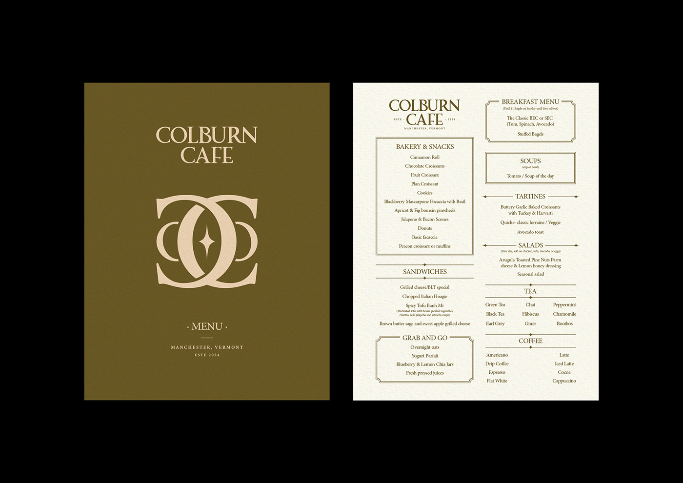
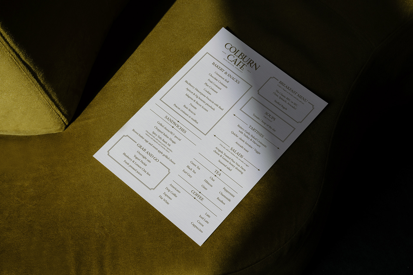
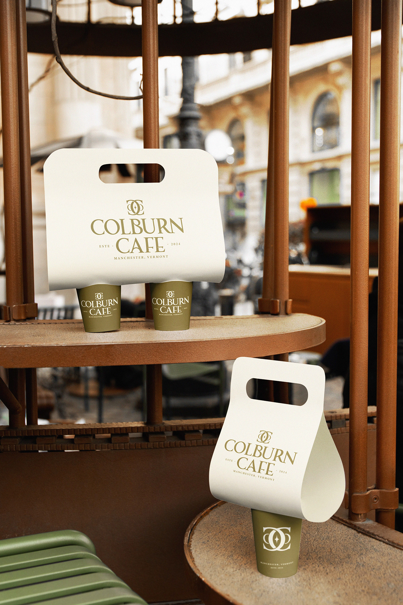
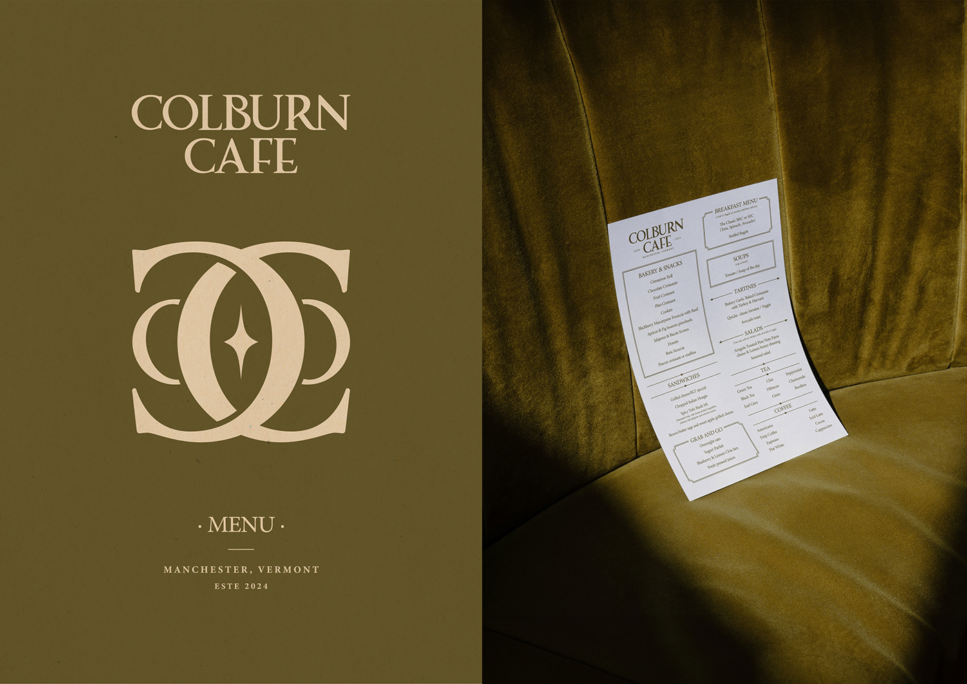
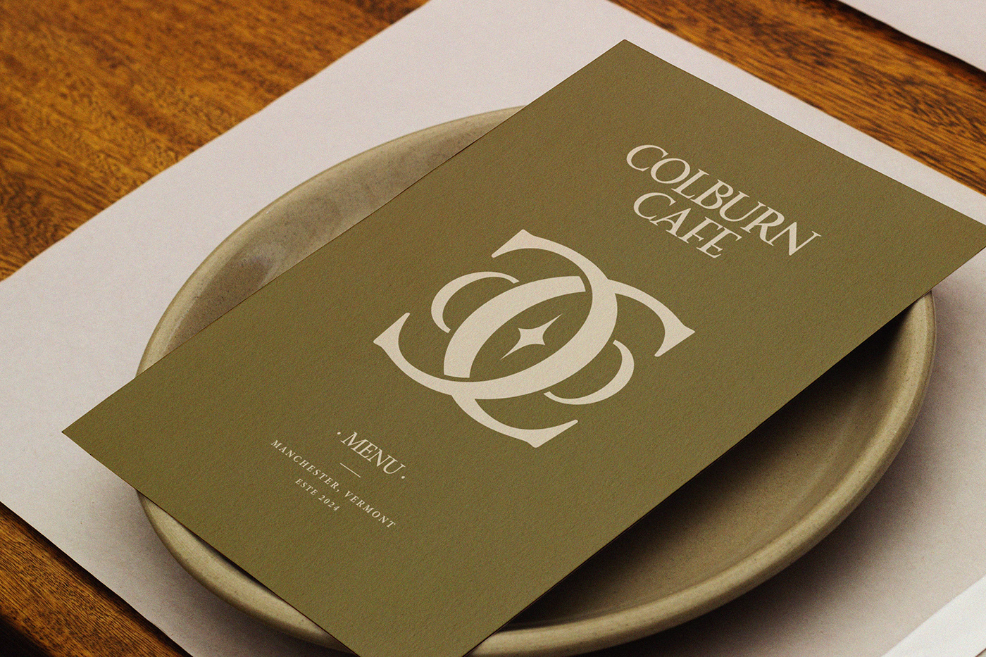
The signature logo of "Colburn Cafe" is created using a classic serif font enriched with curves in some letters, giving
it refinement and elegance. The emblem of the logo consists of two mirrored "C" letters intertwining with each other elegantly, symbolizing harmony and interaction. On the sides of the letters, there are also divided "o" letters,
and in the center, there is a star, adding mystery and intrigue to the logo. The identity of "Colburn Cafe" reflects antique book aesthetics, using double thin frames, serifs, and sharp-ended lines. The signature colors - dark green, milky white, burgundy, blue, and bone white - create an atmosphere of warmthand coziness, emphasizing the vintage character
of the cafe.
"Colburn Cafe" offers its guests not only high-quality coffee but also a unique experience immersing in the atmosphere
of an old library, where every visitor can enjoy the tranquility, exquisite decor, and excellent service. It's the perfect place
for meetings with friends, cozy readings, or simply to enjoy superb coffee in an unusual atmosphere.
Address: Colburn Cafe | 15 Bonnet St. Manchester, Center, VT 05255
Graphic Designer : Sophia Oswald
Customer and Owner : Colburn Cafe
Customer and Owner : Colburn Cafe